
Timeless ideas on everyday essentials
Shop art, gifts, apparel & fun for daily life
New Items
Dropped on 4/27/2026
Easy to wear, easy to pair.
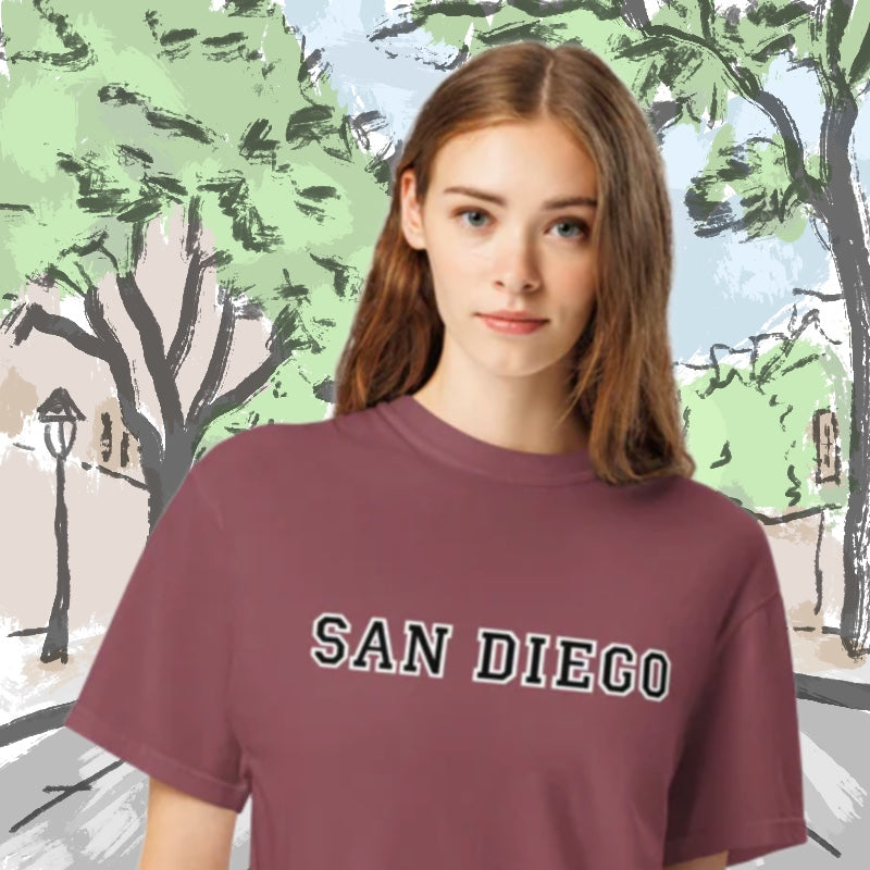
San Diego in a campus-style layout.
Book Club Essentials
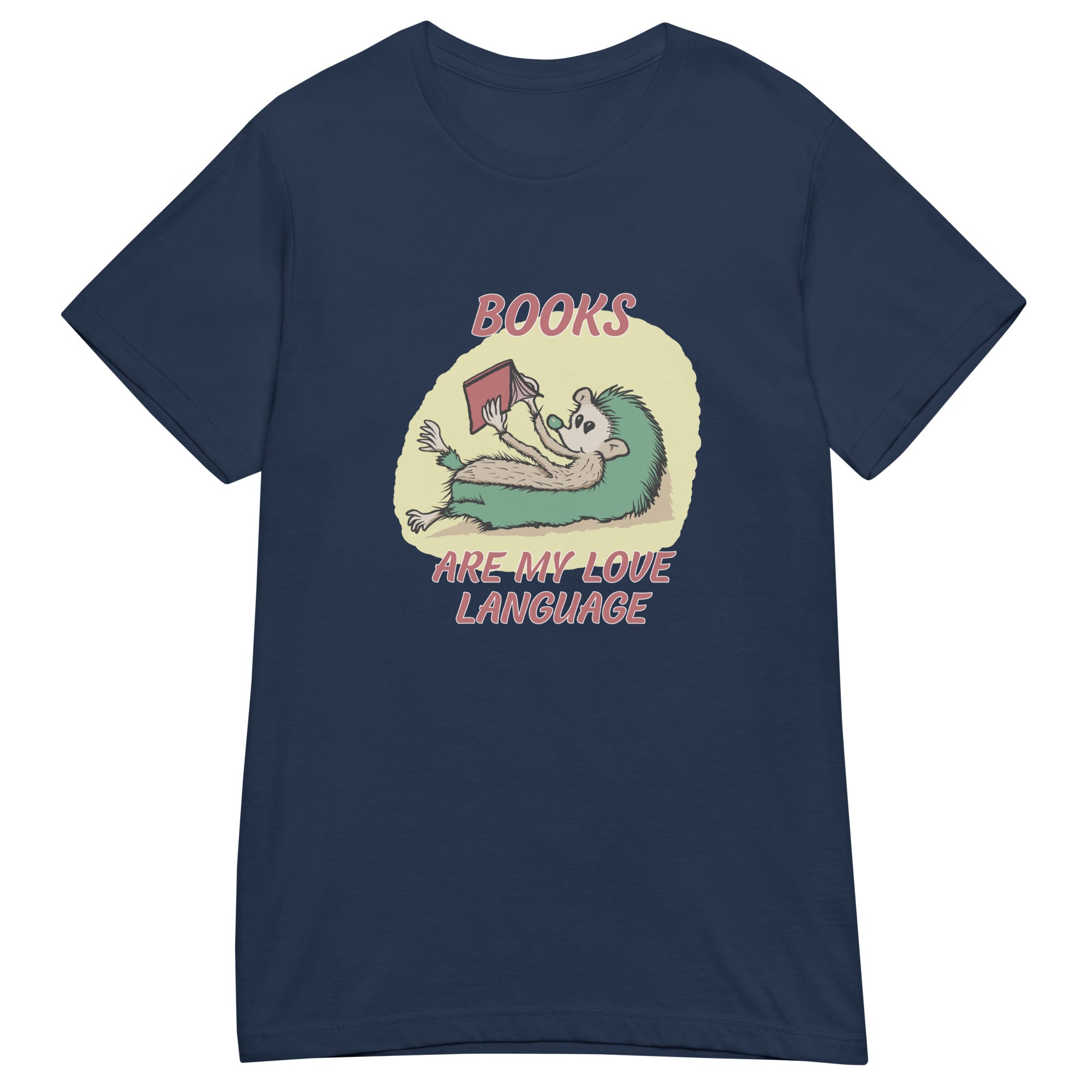
"Books are my love language"
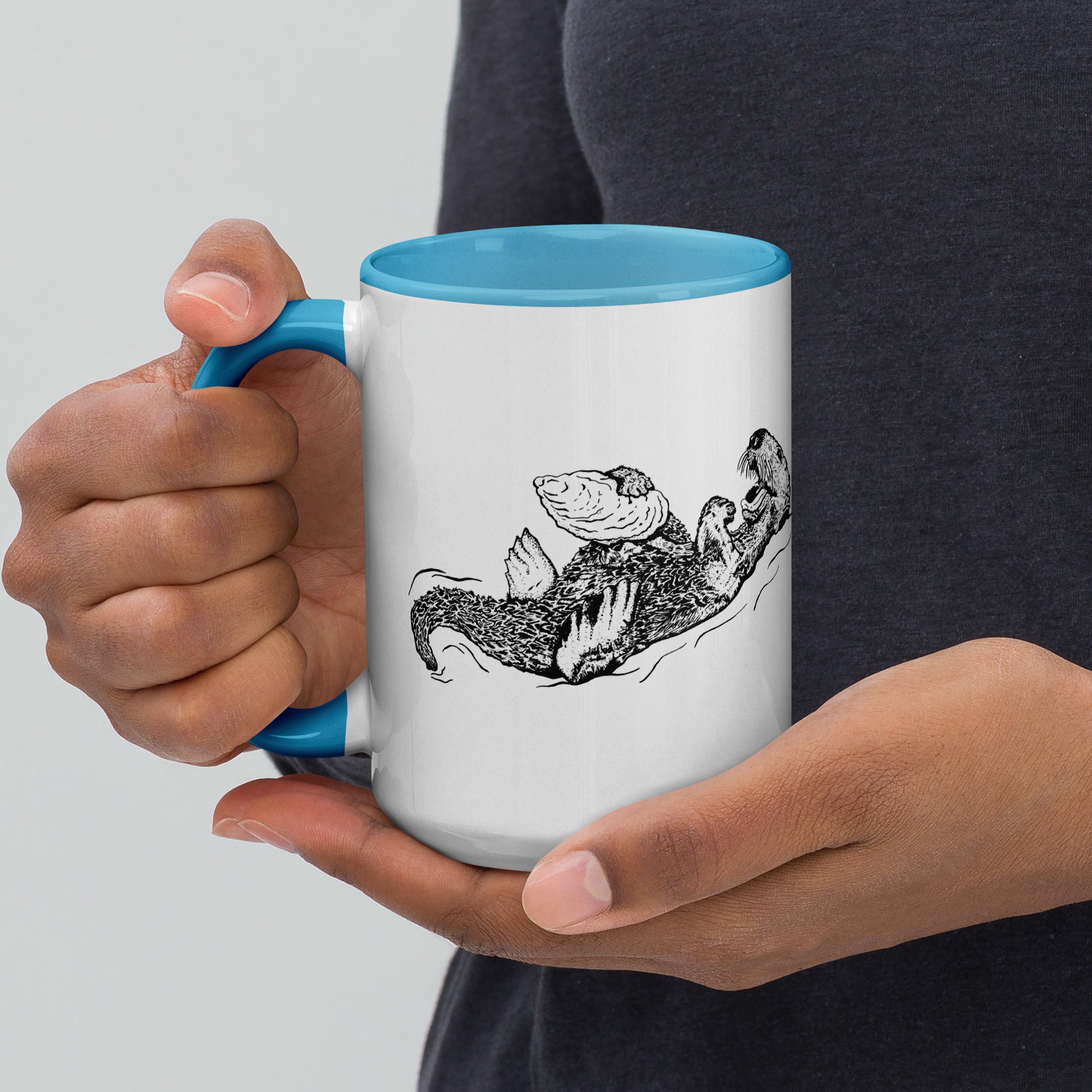
Coffee and tea mugs featuring
artist-drawn original artwork.
Popular
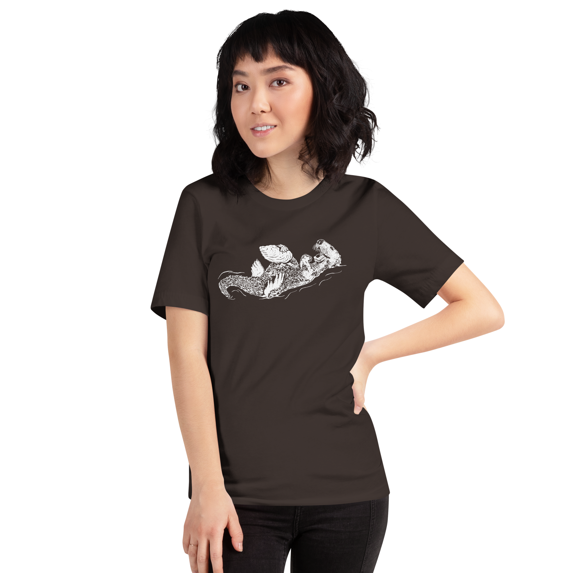
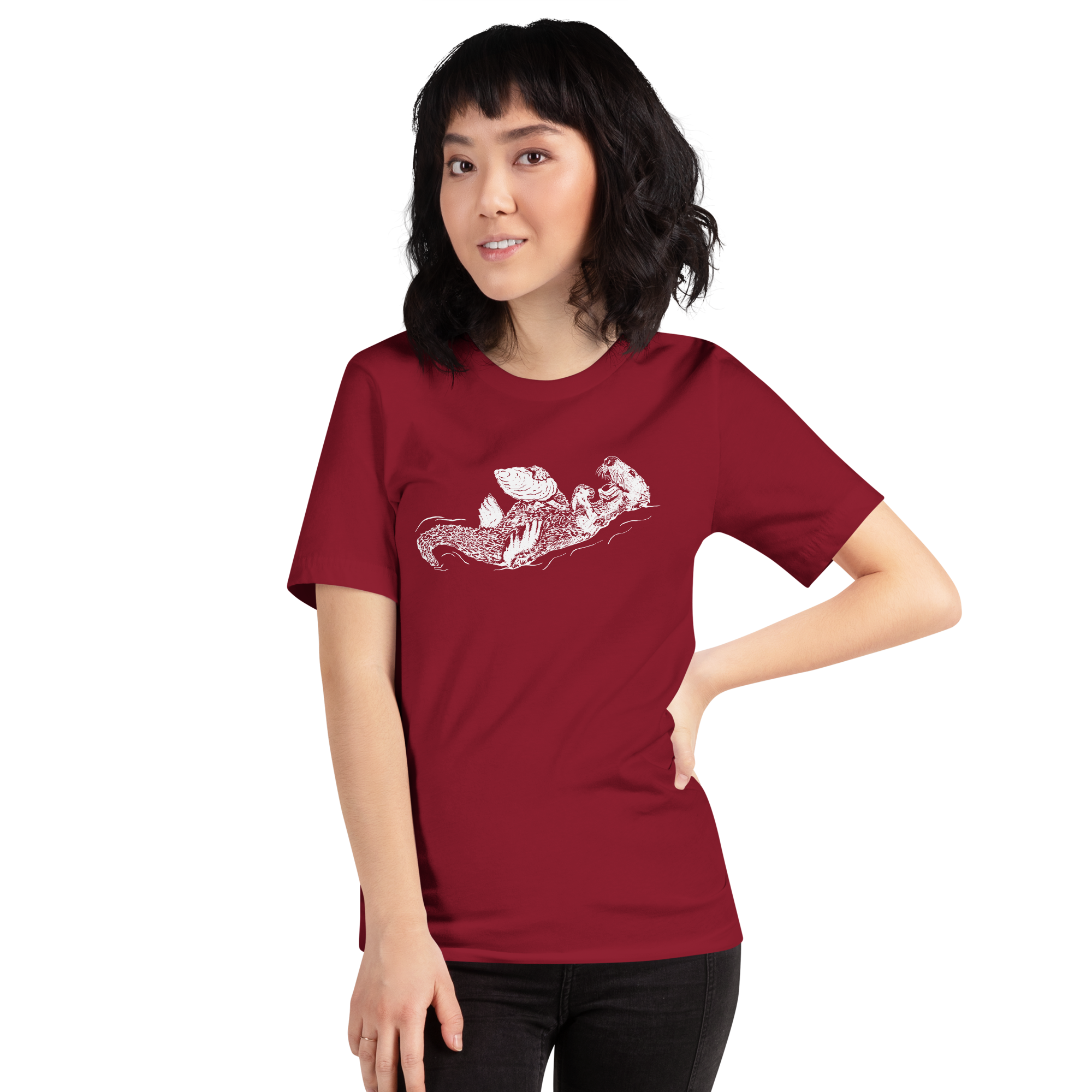
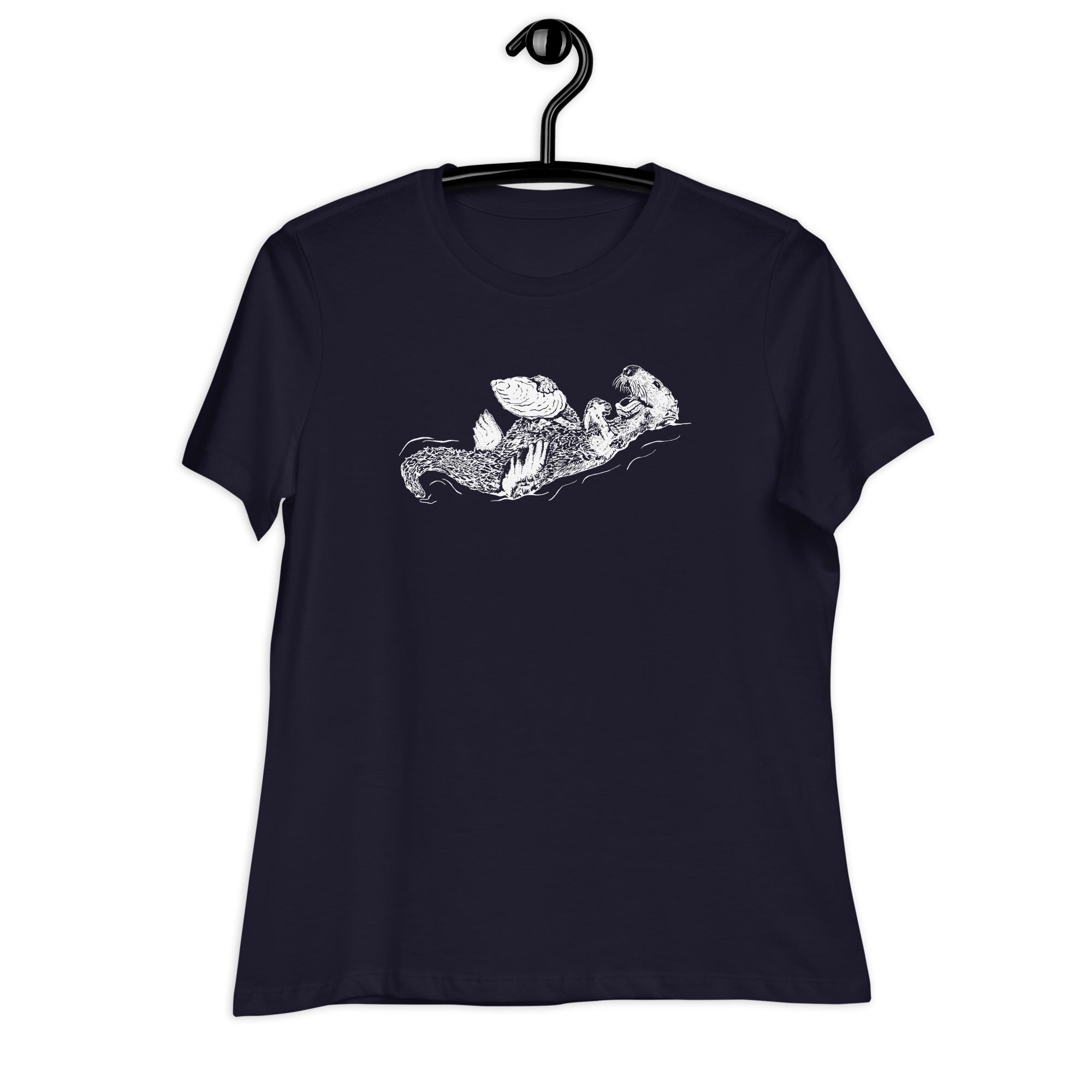
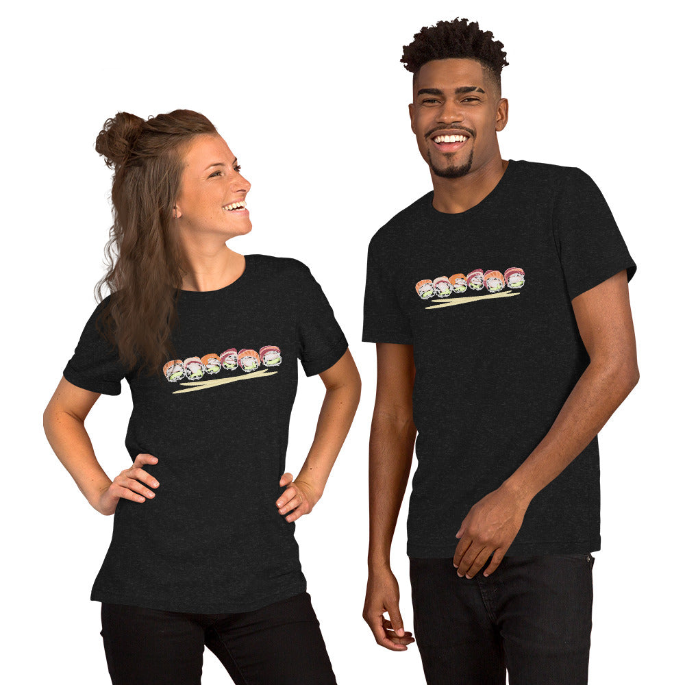
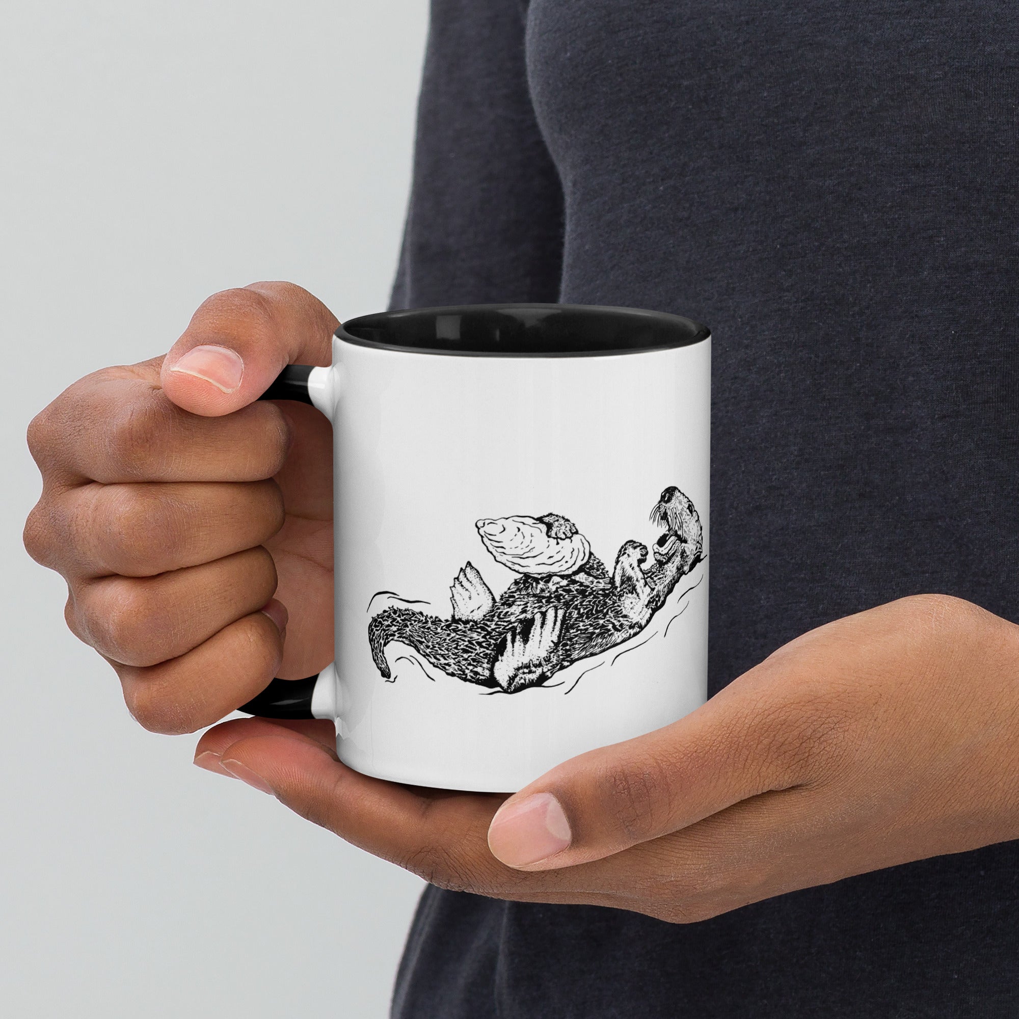
Sea Otter and Oyster T-Shirt Unisex
Sale priceFrom $21.85
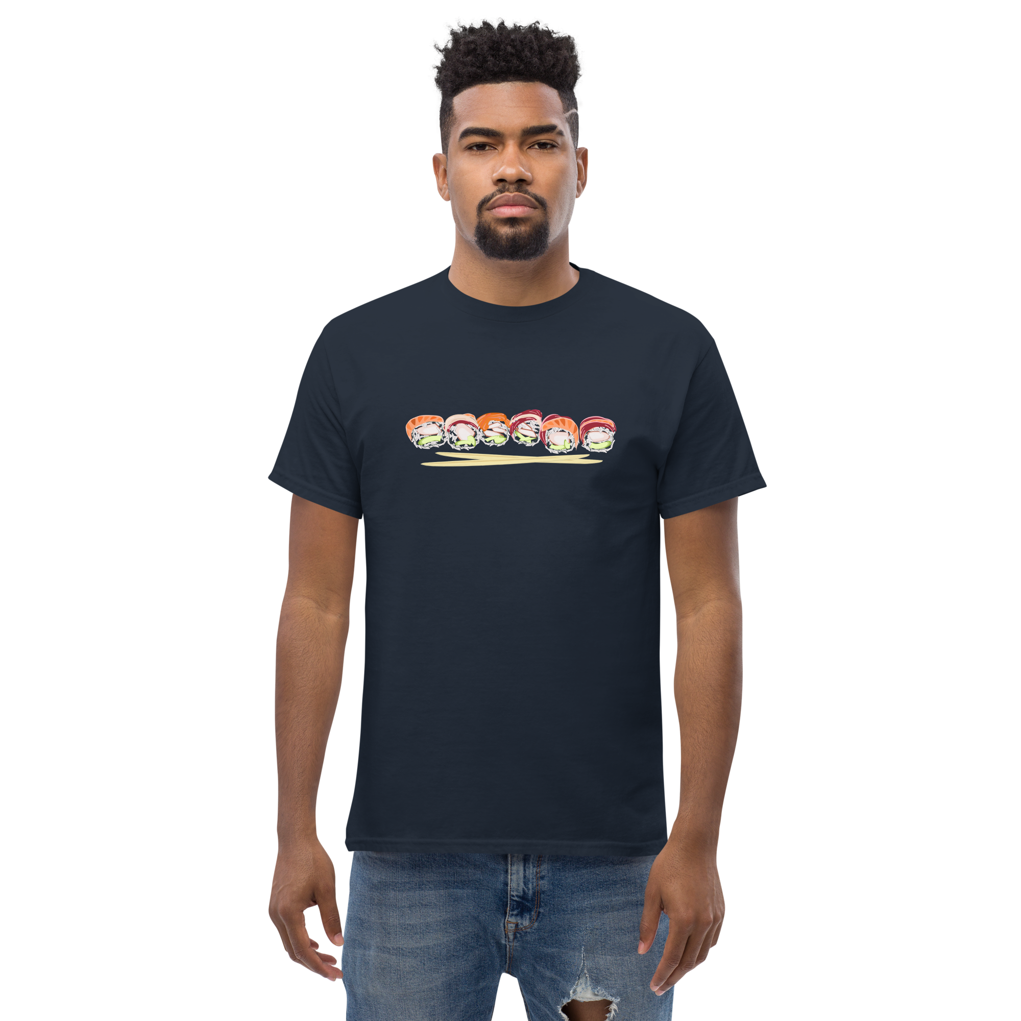
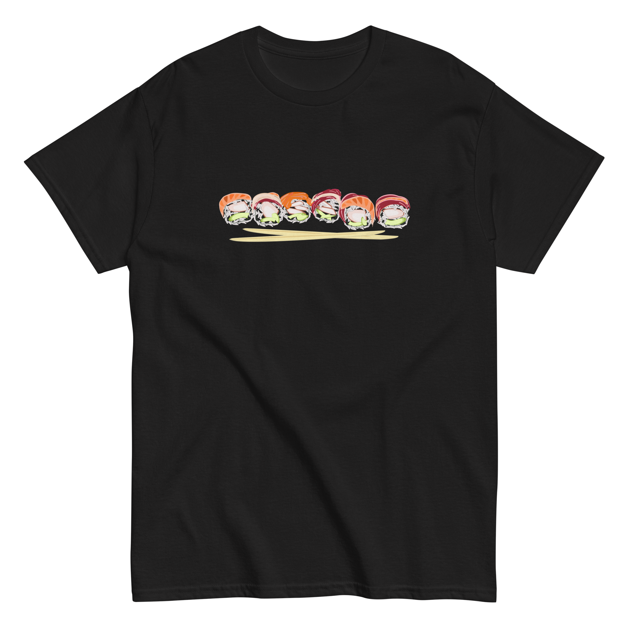
Sushi roll chopsticks T-Shirt
Sale priceFrom $19.55
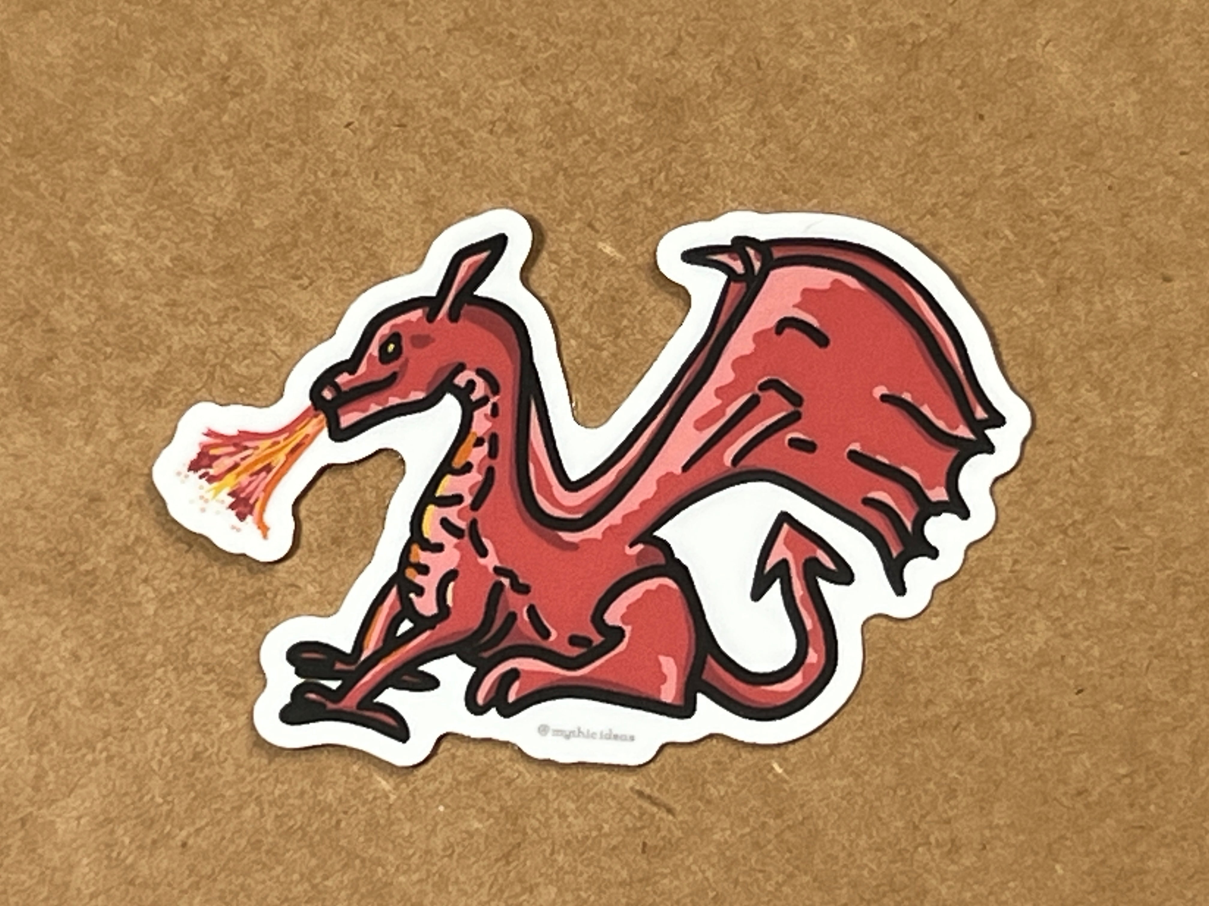
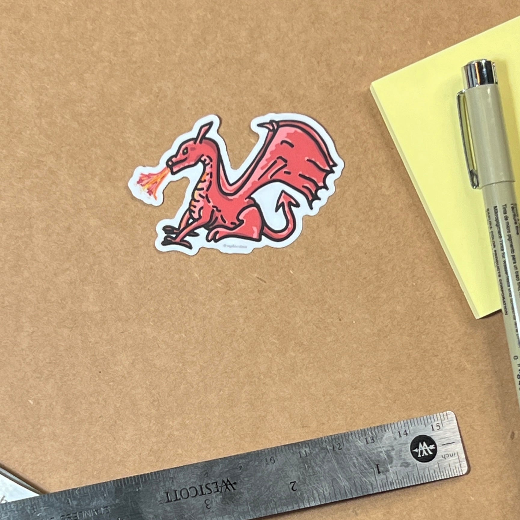
Red Dragon Sticker – 2.5"
Sale price$2.00
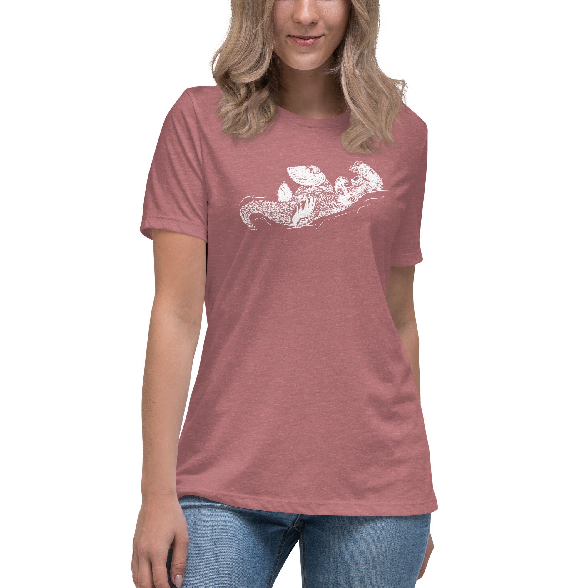
Sea Otter and Oyster Women's Relaxed T-Shirt
Sale priceFrom $24.50
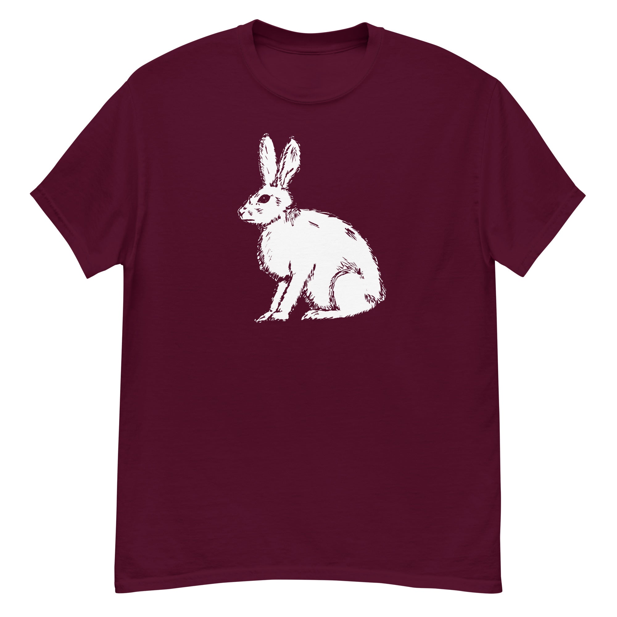
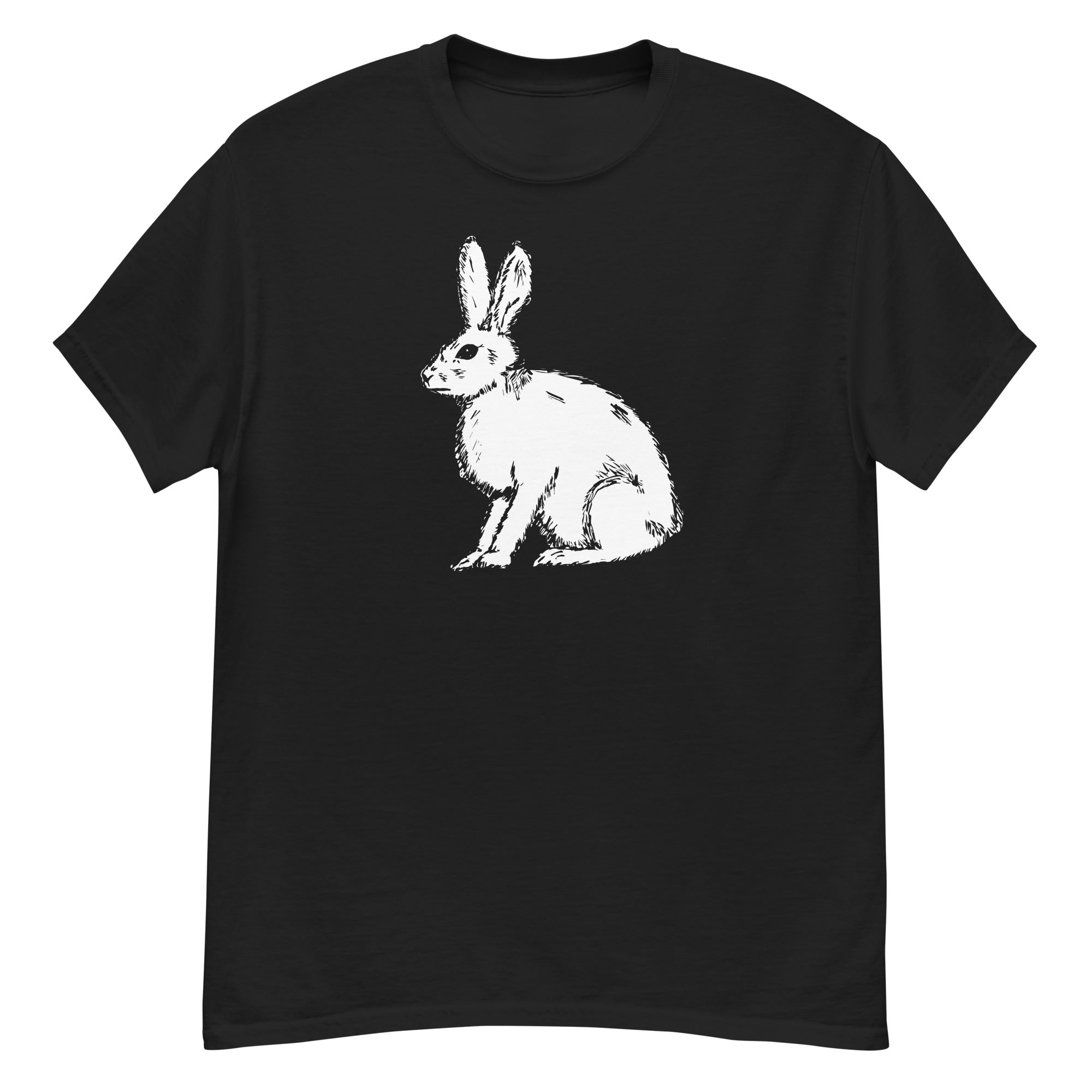
Rabbit - Men's classic tee - Gildan 5000
Sale priceFrom $18.07
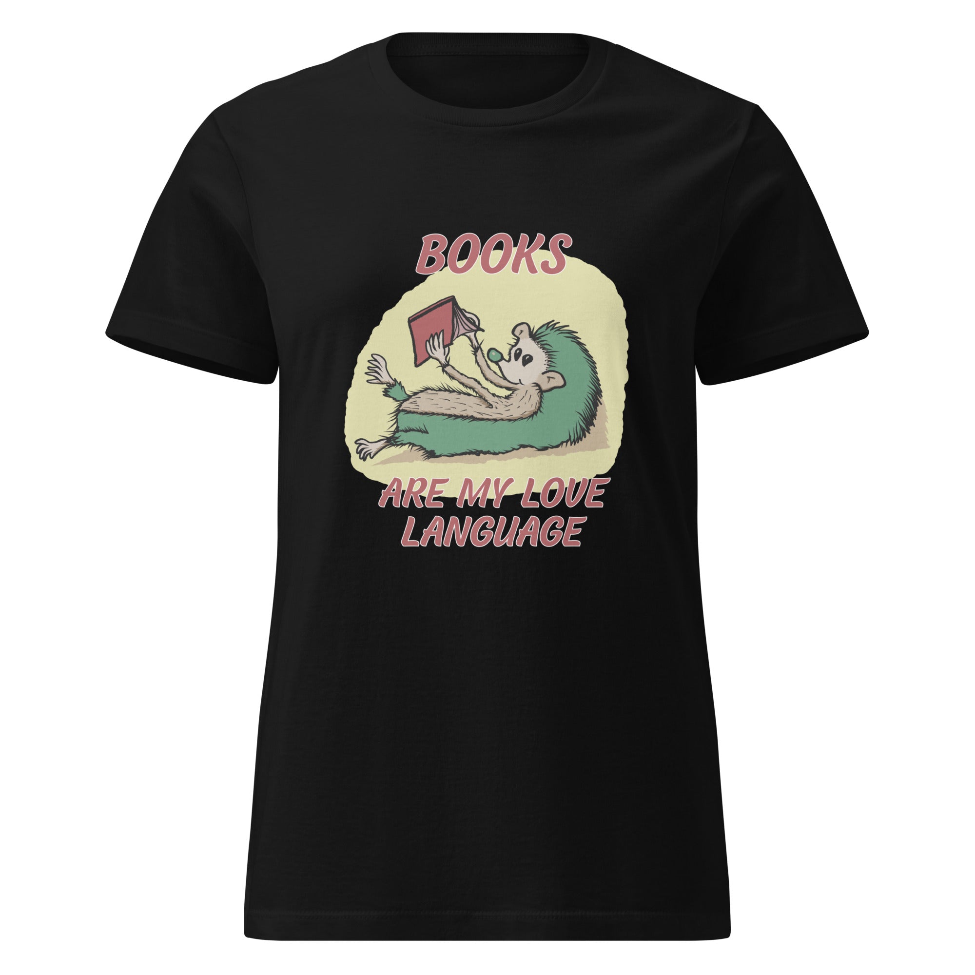
Hedgehog - Books are My Love Language T-Shirt
Sale priceFrom $21.35
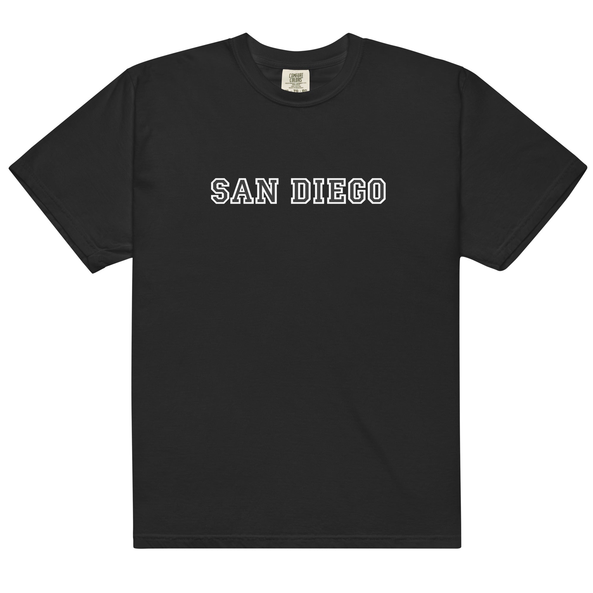
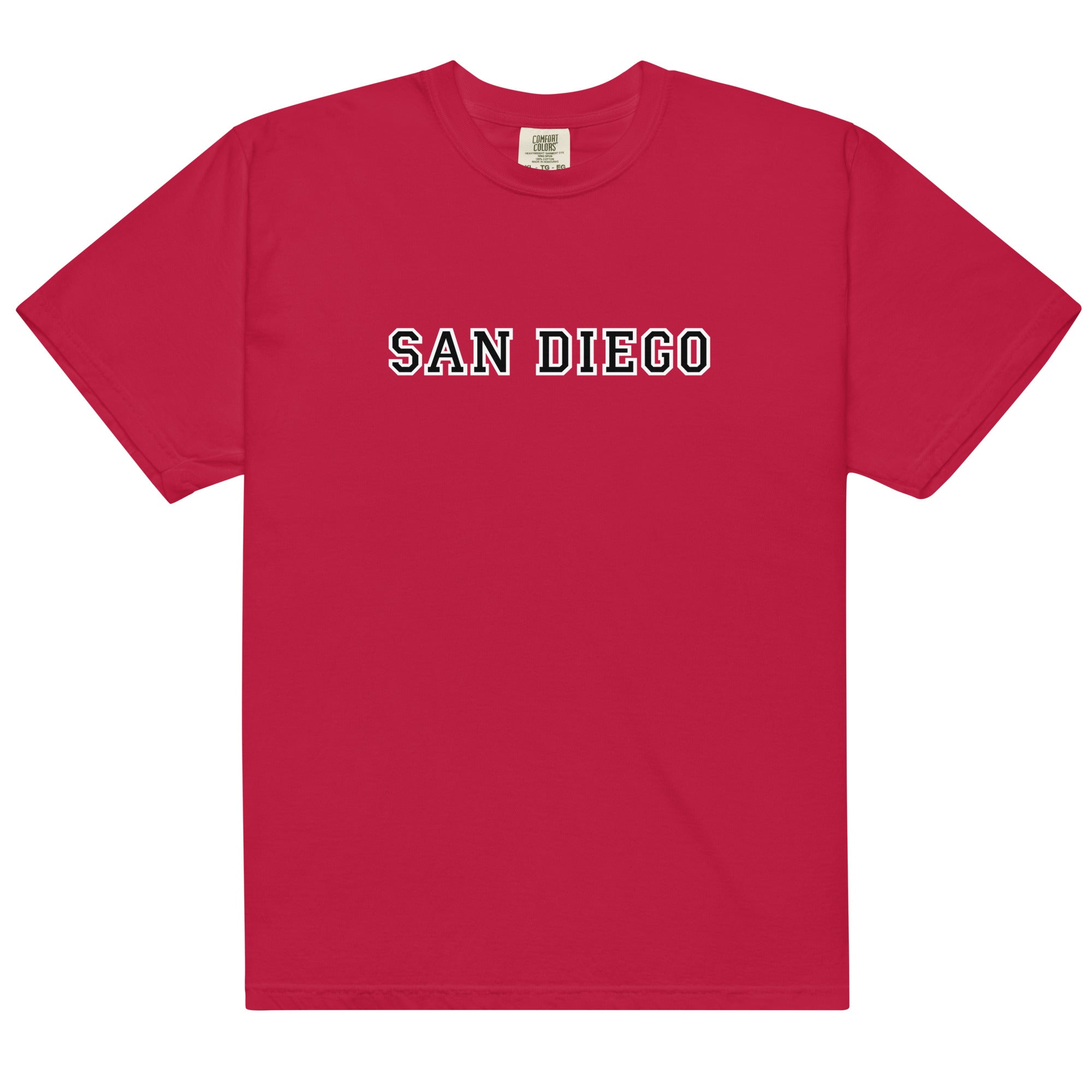
San Diego Campus Style T-Shirt – Classic City Tee - Comfort Colors 1717
Sale priceFrom $28.45
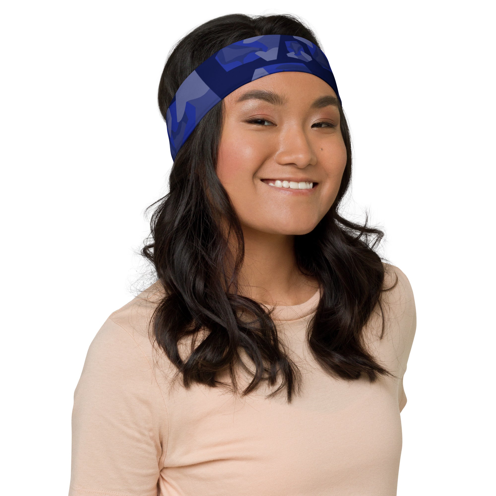
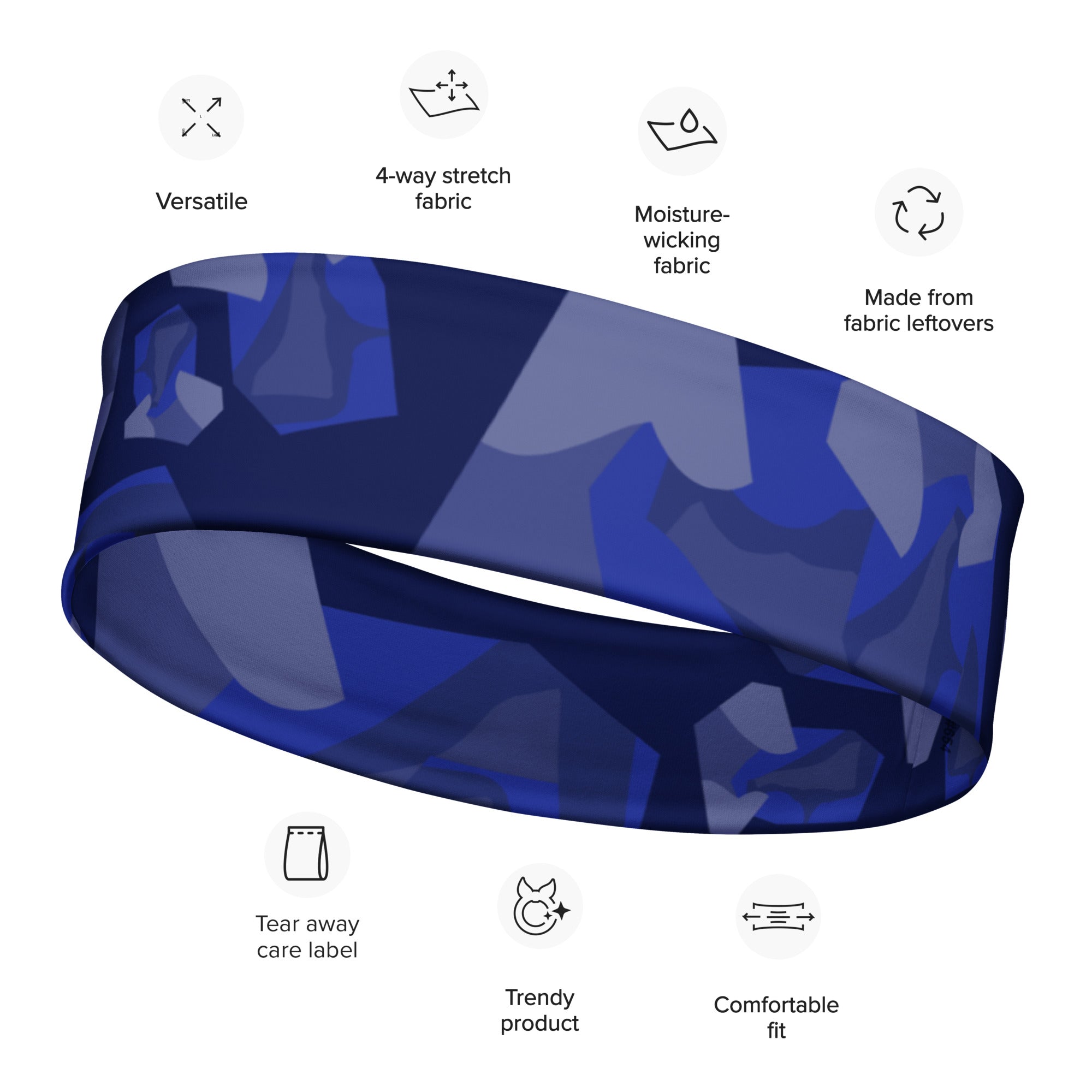
Headband fashion & workout abstract style blue
Sale price$17.89
Comfortable, artist-drawn shirts and sweatshirts made to feel like you.
Shop unique custom mugs featuring nature, travel, food, and art designs. Perfect for gifts!